|
This
article originally appeared in the February 1999
issue of Scientific American. For a
copy of it, please contact Scientific
American at 212.754.0550. We highly
recommend a subscription to this important
magazine.
|
A
Multifractal Walk Down Wall
Street |
|
"The
geometry that describes the shape of coastlines
and the patterns of galaxies also elucidates how
stock prices soar and plummet."
by
Benoit B.
Mandelbrot |
Individual investors and
professional stock and currency traders know
better than ever that prices quoted in any
financial market often change with heart-stopping
swiftness. Fortunes are made and lost in sudden
bursts of activity when the market seems to speed
up and the volatility soars. Last September, for
instance, the stock for Alcatel, A French
telecommunications equipment manufacturer, dropped
about 40 percent one day and fell another 6
percent over the next few days. In a reversal, the
stock shot up 10 percent on the fourth day.
The
classical financial models used for most of this
century predict that such precipitous events
should never happen. A cornerstone of finance is
modern portfolio theory, which tries to maximize
returns for a given level of risk. The mathematics
underlying portfolio theory handles extreme
situations with benign neglect: it regards
large market shifts as too unlikely to matter or
as impossible to take into account. It is
true that portfolio theory may account for what
occurs 95 percent of the time in the market. But
the picture it presents does not reflect reality,
if one agrees that major events are part of the
remaining 5 percent. An inescapable analogy is
that of a sailor at sea. If the weather is
moderate 95 percent of the time, can the mariner
afford to ignore the possibility of a
typhoon?
The
risk-reducing formulas behind portfolio theory
rely on a number of demanding and ultimately
unfounded premises. First, they suggest that price
changes are statistically independent of one
another: for example, that todays price has no
influence on the changes between the current price
and tomorrows. As a result, predictions of future
market movements become impossible. The second
presumption is that all price changes are
distributed in a pattern that conforms to the
standard bell curve. The width of the bell shape
(as measured by its sigma, or standard deviation)
depicts how far price changes diverge from the
mean; events at the extremes are considered
extremely rare. Typhoons are, in effect, defined
out of existence.
Do
financial data neatly conform to such assumptions?
Of course, they never do. Charts of stock or
currency changes over time do reveal a constant
background of small up and down price movements
but not as uniform as one would expect if price
changes fit the bell curve. These patterns,
however, constitute only one aspect of the graph.
A substantial number of sudden large changes
spikes on the chart that shoot up and down as with
the Alcatel stock stand out from the background
of more moderate perturbations. Moreover, the
magnitude of price movements (both large and
small) may remain roughly constant for a year, and
then suddenly the variability may increase for an
extended period. Big price jumps become more
common as the turbulence of the market grows
clusters of them appear on the chart.
According to portfolio
theory, the probability of these large
fluctuations would be a few millionths of a
millionth of a millionth of a millionth. (The
fluctuations are greater than 10 standard
deviations.) But in fact, one observes spikes on a
regular basis as often as every month and
their probability amounts to a few hundredths.
Granted, the bell curve is often described as
normal or, more precisely, as the normal
distribution. But should financial markets then be
described as abnormal? Of course not they are
what they are, and it is portfolio theory that is
flawed.
Modern
portfolio theory poses a danger to those who
believe in it too strongly and is a powerful
challenge for the theoretician. Though sometimes
acknowledging faults in the present body of
thinking, its adherents suggest that no other
premises can be handled through mathematical
modeling. This contention leads to the question of
whether a rigorous quantitative description of at
least some features of major financial upheavals
can be developed. The bearish answer is that large
market swings are anomalies, individual "acts of
God" that present no conceivable regularity.
Revisionists correct the questionable premises of
modern portfolio theory through small fixes that
lack any guiding principle and do not improve
matters sufficiently. My own work carried out
over many years takes a very different and
decidedly bullish position.
I
claim that variations in financial prices can be
accounted for by a model derived from my work in
fractal geometry. Fractals or their later
elaboration, call multifractals do not purport
to predict the future with certainty. But they do
create a more realistic picture of market risks.
Given the recent troubles confronting the large
investment pools call hedge funds, it would be
foolhardy not to investigate models providing more
accurate estimates of risk.
Multifractals and the
Market
An
extensive mathematical basis already exists for
fractals and multifractals. Fractal patterns
appear not just in the price changes of securities
but in the distribution of galaxies throughout the
cosmos, in the shape of coastlines and in the
decorative designs generated by innumerable
computer programs.
A
fractal is a geometric shape that can be separated
into parts, each of which is a reduced-scale
version of the whole. In finance, this concept is
not a rootless abstraction but a theoretical
reformulation of a down-to-earth bit of market
folklore namely, that movements of a stock or
currency all look alike when a market chart is
enlarged or reduced so that is fits the same time
and price scale. An observer then cannot tell
which of the data concern prices that change from
week to week, day to day or hour to hour. This
quality defines the charts as fractal curves and
makes available many powerful tools of
mathematical and computer analysis.
A more
specific technical term for the resemblance
between the parts and the whole is self-affinity.
This property is related to the better-known
concept of fractals called self-similarity, in
which every feature of a picture is reduced or
blown up by the same ratio a process familiar to
anyone who has ever ordered a photographic
enlargement. Financial market charts, however, are
far from being self-similar.
|
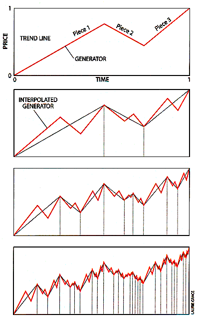
Illustration 1 -
THREE-PIECE-FRACTAL GENERATOR (top) can
be interpolated repeatedly into each piece of
subsequent charts (bottom three
diagrams). The pattern that emerges
icreasingly resembles market price
oscillations. (The interpolated generator
is inverted for each descending
piece.) |
|
|
In a
detail of a graphic in which the features are
higher than they are wide as are the individual
up-and-down price ticks of a stock the
transformation from the whole to a part must
reduce the horizontal axis more than the vertical
one. For a price chart, this transformation must
shrink the time-scale (the horizontal axis) more
than the price scale (the vertical axis). The
geometric relation of the whole to its parts is
said to be one of self-affinity.
The
existence of unchanging properties is not given
much weight by most statisticians. But they are
beloved of physicists and mathematicians like
myself, who call them invariances and are happiest
with models that present an attractive invariance
property. A good idea of what I mean is provided
by drawing a simple chart that inserts price
changes from time 0 to a later time 1 in
successive steps. The intervals themselves are
chosen arbitrarily; they may represent a second,
an hour, a day or a year.
The
process begins with a price, represented by a
straight trend line (illustration 1). Next,
a broken line called a generator is used to create
the pattern that corresponds to the up-and-down
oscillations of a price quoted in financial
markets. The generator consists of three pieces
that are inserted (interpolated) along the
straight trend line. (A generator with fewer than
three pieces would not simulate a price that can
move up and down.) After delineating the initial
generator, its three pieces are interpolated by
three shorter ones. Repeating these steps
reproduces the shape of the generator, or price
curve, but at compressed scales. Both the
horizontal axis (timescale) and the vertical axis
(price scale) are squeezed to fit the horizontal
and vertical boundaries of each piece of the
generator.
Interpolations
Forever
Only
the first stages are shown in the illustration,
although the same process continues. In theory, it
has no end, but in practice, it makes no sense to
interpolate down to time intervals shorter than
those between trading transactions, which may
occur in less than a minute. Clearly, each piece
ends up with a shape roughly like the whole. That
is, scale invariance is present simply because it
was built in. The novelty (and surprise) is that
these self-affine fractal curves exhibit a wealth
of structure a foundation of both fractal
geometry and the theory of chaos.
A few
selected generators yield so-called unifractal
curves that exhibit the relatively tranquil
picture of the market encompassed by modern
portfolio theory. But tranquillity prevails only
under extraordinarily special conditions that are
satisfied only by these special generators. The
assumptions behind this oversimplified model are
one of the central mistakes of modern portfolio
theory. It is much like a theory of sea waves that
forbids their swells to exceed six
feet.
The
beauty of fractal geometry is that it makes
possible a model general enough to reproduce the
patterns that characterize portfolio theorys
placid markets as well as the tumultuous trading
conditions of recent months. The just described
method of creating a fractal price model can be
altered to show how the activity of markets speeds
up and slows down the essence of volatility.
This variability is the reason that the prefix
"multi-" was added to the word
"fractal."
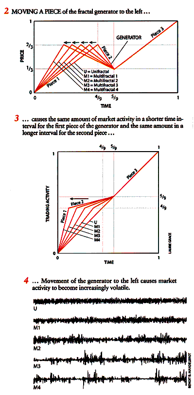
To
create a multifractal from a unifractal, the key
step is to lengthen or shorten the horizontal time
axis so that the pieces of
the
generator are either stretched or squeezed. At the
same time, the vertical price axis may remain
untouched. In illustration 2, the first
piece of the unifractal generator is progressively
shortened, which also provides room to lengthen
the second piece. After making these adjustments,
the generators become multifractal (M1 to M4).
Market activity speeds up in the interval of time
represented by the first piece of the generator
and slows in the interval that corresponds to the
second piece (illustration 3).
Such
an alteration to the generator can produce a full
simulation of price fluctuations over a given
period, using the process of interpolation
described earlier. Each time the first piece of
the generator is further shortened and the
process of successive interpolation is undertaken
it produces a chart that increasingly resembles
the characteristics of volatile markets
(illustration 4).
The
unifractal (U) chart shown here (before any
shortening) corresponds to the becalmed markets
postulated in the portfolio theorists model.
Proceeding down the stack (M1 to M4), each chart
diverges further from that model, exhibiting the
sharp, spiky price jumps and the persistently
large movements that resemble recent trading. To
make these models of volatile markets achieve the
necessary realism, the three pieces of each
generator were scrambled a process not shown in
the illustrations. It works as follows: imagine a
die on which each side bears the image of one of
the six permutations of the pieces of the
generator. Before each interpolation, the die is
thrown, and then the permutation that comes up is
selected.
What
should a corporate treasurer, currency trader or
other market strategist conclude from all this?
The discrepancies between the pictures painted by
modern portfolio theory and the actual movement of
prices are obvious. Prices do not vary
continuously, and they oscillate wildly at all
timescales. Volatility far from a static entity
to be ignored or easily compensated for is at
the very heart of what goes on in financial
markets. In the past, money managers embraced the
continuity and constrained price movements of
modern portfolio theory because of the absence of
strong alternatives. But a money manager need no
longer accept the current financial models at face
value.
Instead multifractals can
be put to work to "stress-test" a portfolio. In
this technique the rules underlying multifractals
attempt to create the same patterns of variability
as do the unknown rules that govern actual
markets. Multifractals describe accurately the
relation between the shape of the generator and
the patterns of up-and-down swings of prices to be
found on charts of real market data.
On a
practical level, this finding suggests that a
fractal generator can be developed based on
historical market data. The actual model used does
not simply inspect what the market did yesterday
or last week. It is in fact a more realistic
depiction of market fluctuations, called
fractional Brownian motion in multifractal trading
time. The charts created from the generators
produced by this model can simulate alternative
scenarios based on previous market
activity.
These
techniques do not come closer to forecasting a
price drop or rise on a specific day on the basis
of past records. But they provide estimates of the
probability of what the market might do and allow
one to prepare for inevitable sea changes. The new
modeling techniques are designed to cast a light
of order into the seemingly impenetrable thicket
of the financial markets. They also recognize the
mariners warning that, as recent events
demonstrate, deserves to be heeded: On even the
calmest sea, a gale may be just over the
horizon.
|
Pick the
Fake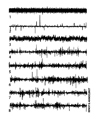
How do
multifractals stand up against actual records of
changes in financial prices? To assess their
performance, let us compare several historical
series of price changes with a few artificial
models. The goal of modeling the patterns of
real markets is certainly not fulfilled by the
first chart, which is extremely monotonous and
reduces to a static background of small price
changes, analogous to the static noise from a
radio. Volatility stays uniform with no sudden
jumps. In a historical record of this kind,
daily chapters would vary from one another, but
all the monthly chapters would read very much
alike. The rather simple second chart is less
unrealistic, because is shows many spikes;
however, these are isolated against an
unchanging background in which the overall
variability of prices remains constant. The
third chart has interchanged strengths and
failings, because it lacks any precipitous
jumps.
The eye tells us
that these three diagrams are unrealistically
simple. Let us now reveal the sources. Chart 1
illustrates price fluctuations in a model
introduced in 1900 by French mathematician Louis
Bachelier. The changes in prices follow a
"random walk" that conforms to the bell curve
and illustrates the model that underlies modern
portfolio theory. Charts 2 and 3 are partial
improvements on Bacheliers
work: a model I proposed in 1963 (based on Levy
stable random processes) and one I published in
1965 (based on fractional Brownian motion).
These revisions, however, are inadequate, except
under certain special market conditions.
In
the more important five lower diagrams of the
graph, at least one is a real record and at
least another is a computer-generated sample of
my latest multifractal model. The reader is free
to sort those five lines into the appropriate
categories. I hope the forgeries will be
perceived as surprisingly effective. In fact,
only two are real graphs of market activity.
Chart 5 refers to the changes in price of IBM
stock, and chart 6 shows price fluctuations for
the dollar-deutsche mark, exchange rate. The
remaining charts (4, 7 and 8) bear a strong
resemblance to their two real-world
predecessors. But they are completely
artificial, having been generated through a more
refined form of my multifractal model.
-B.B.M.
|
The
Author
Benoit
B. Mandelbrot has contributed to numerous fields
of science and art. A mathematician by training,
he has served since 1987 as Abraham Robinson
Professor of Mathematical Sciences at Yale
University and IBM Fellow Emeritus (Physics) at
the Thomas J. Watson Reasearch Center in Yorktown
Heights, N.Y., where he worked from 1958 to 1993.
He is a fellow of the American Academy of Arts and
Sciences and foreign associate of the U.S.
National Academy of Sciences and the Norwegian
Academy. His awards include the 1993 Wolf Prize
for physics, the Barnard, Franklin and Steinmetz
medals, and the Science for Art, Harvey, Humboldt
and Honda prizes.
Further
Reading
The
Fractal Geometry of Nature. Benoit B. Mandelbrot.
W.H. Freeman and Company, 1982.
Fractals and Scaling in
Finance: Discontinuity, Concentration,
Risk.
Benoit B. Mandelbrot. Springer-Verlag,
1997.
"The
Multifractal Model of Asset Returns." Discussion
papers of the Cowles Foundation for Economics,
Nos. 114-1166. Laurent Calvert, Adlai Fisher and
Benoit B. Mandelbrot. Cowles Foundation, Yale
University, 1997.
Multifractals and 1/F
Noise: Wild Self-Affinity in
Physics.
Benoit B. Mandelbrot, Springer-Verlag,
1999.
|